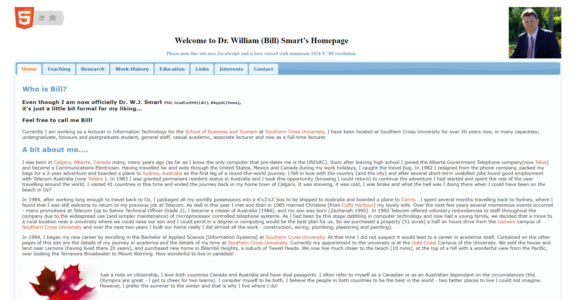
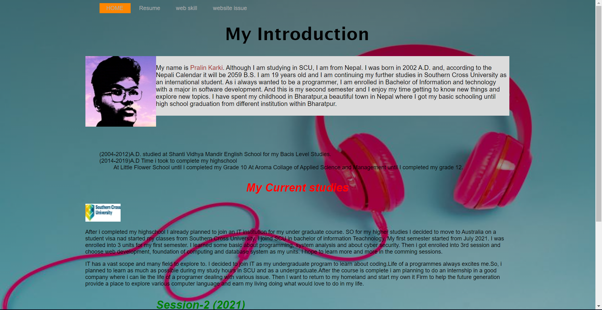
When i try to refrence the Bill smart's I can find that my webpage is not well organized.The Bill Smarts page has a photo in the top corner followed by the title in the center and navigation just below the title. The web page is simple however it has just correct amount of information ands looks tidy.but when my page is abit not well organized. The picture of mine is abit not in proper place and the content on the page are not relatable well organized. While making a webpage there are some issue that will come across. The context or the visual representation can make the website offensive. The website must be suitable for all teh people to use so any thing that affects one is a big isuue in ones page. like wise my page also has some page with the issues. The format I presented my website is really unorganized and the issue that comes when operating in the different devices make it quite inconvinent to use it. The homepage contains some information about me and in the same place i have my academic record which is just much for the homepage.It makes it really bad experience for the person going through the page. its best to keep all these pages sperate like the one in bill smarts page where there are many navigation to hover over to see his achivements.
The correction for all the issue has been made and the link provided below shows the correction made Click here to see correction